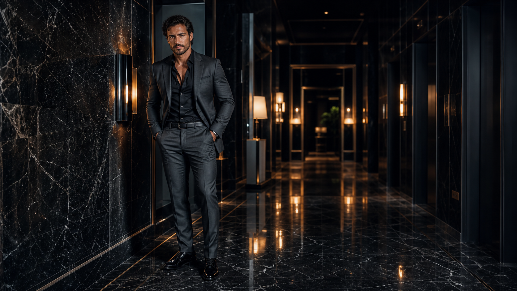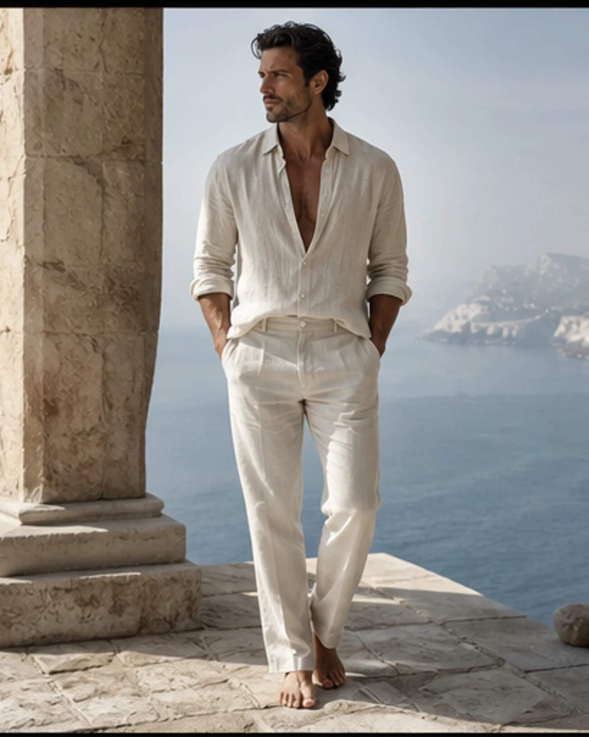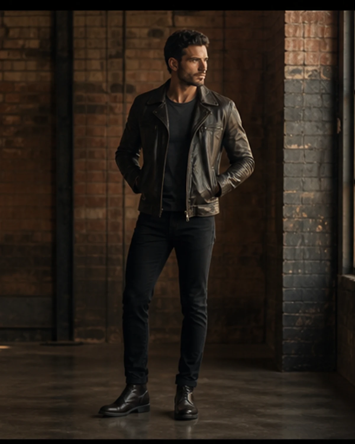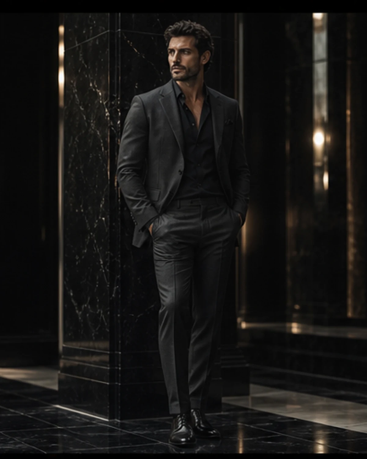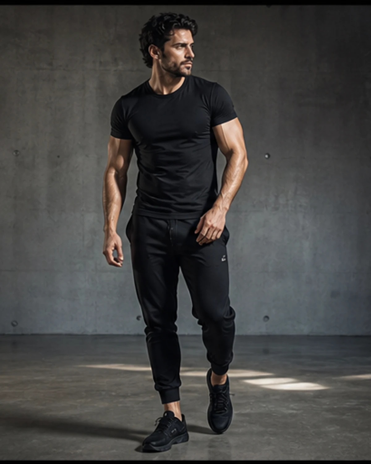
The word musclehunks can suggest a blunt visual formula, but the strongest editorial work begins by refusing that shortcut. This guide approaches fashion proportion for muscular men as a complete image-making problem: subject, clothing, setting, light and sequence must support one another. A developed physique may create the first graphic impression, yet it is the control around that impression that makes a photograph worth returning to. ViceHeaven’s point of view is sensual without becoming explicit, masculine without reducing masculinity to size, and attentive to the difference between a striking single frame and a coherent visual story.
Our starting environment is a pale modern penthouse that makes every change of silhouette immediately visible. Location matters because it gives the body a visual scale and prevents a portrait from floating in an anonymous studio vacuum. Hard architecture can make a relaxed posture feel softer; weathered surfaces can give polished styling more tension; an open horizon can make a close crop feel newly intimate when it arrives later in the edit. The photographer should map three distances before shooting: an establishing view, a conversational three-quarter portrait and a detail frame. That simple structure turns a collection of muscle hunks photos into an editorial with a beginning, development and release.
Wardrobe establishes the next layer. Here, relaxed trousers, structured outerwear and a crisp white shirt alternate fitted and generous proportions. Clothes should acknowledge an athletic build without appearing selected only to advertise it. Strong shoulders change the fall of a jacket, a fitted knit changes the negative space around the waist, and heavier denim can balance a broad upper frame. Those are composition questions, not rules about what muscular men are allowed to wear. The best dressed muscular men understand proportion: one deliberate fitted element is often more persuasive than an entire look pulled tight, while an oversized layer gains purpose when its movement is visible in the photographs.
Light supplies the emotional temperature. For this story, broad window light keeps fabric texture visible while a negative fill gives the silhouette definition. Muscle definition is easy to exaggerate with a hard source, but relentless contrast quickly becomes monotonous. A useful sequence alternates descriptive light with atmosphere: one frame explains the silhouette, another lets part of it disappear, and a third uses reflection or backlight to separate the figure from the room. This rhythm respects physique without turning every image into an anatomical diagram. Handsome muscular men are compelling editorial subjects because strength can register through posture, fabric and pace as clearly as it does through exposed form.
The central craft decision is letting tailoring follow the body without asking every garment to outline it. Direction should be specific enough to create continuity but open enough for a natural gesture to survive. Instead of asking for a generic powerful pose, a photographer can give the subject an action: cross the room, adjust a cuff, look toward a changing light, sit and let the jacket settle. Small tasks produce believable transitions. They also create varied lines through the shoulders and torso, allowing hunky muscle men to appear present rather than displayed. The camera records attention, and a subject with something to attend to gives the viewer more than surface.
Editing is where the theme becomes legible. Begin with the image that states the world, not necessarily the closest portrait or the frame with the most visible physique. Follow it with a change of distance, then introduce the strongest facial connection once the setting has been established. A six-to-eight-frame muscle men gallery benefits from restraint: two images that perform the same job weaken each other, even if both are individually attractive. Look for changes in gaze, geometry, fabric and light. The final frame should feel like an exit or an afterimage rather than another version of the opener.
Language around the pictures deserves the same care. Search phrases such as muscle hunks, muscular hunks and beefy men editorial can describe a reader’s interest, but they should never replace an actual observation. Captions can identify how a location, garment or lighting choice changes a frame. Introductions can explain the visual question the sequence explores. Alt text should describe the specific photograph rather than repeat a keyword. This makes the page more useful to readers and more honest to the work, while still allowing the broader musclehunks theme to connect profiles, galleries, guides and videos across the site.
A responsible visual profile also distinguishes editorial fiction from documentary identity. The original characters linked here are clearly labeled fictional AI-created adults. That disclosure is not a footnote to the experience; it tells readers what kind of image they are viewing and prevents an invented portrait from borrowing the biography of a real person. Official video links remain hosted by their publishers and are framed with ViceHeaven commentary rather than copied descriptions. Clear sourcing allows the magazine to build an expansive male visual archive without blurring ownership, identity or context.
On a practical level, a strong collection should lead somewhere. A reader may enter through this guide, move to a fictional muscle male model profile, open a full photo editorial and then watch an official platform video about screen presence or public performance. Those links are editorial pathways, not decorative recommendations. Each destination should add a different medium or angle. That is how a topic cluster becomes genuinely useful: the text explains decisions, the image set demonstrates them, the profile provides a recurring visual character and the video introduces movement, voice or real-world performance.
The final measure is not how many times a familiar phrase appears, but whether the edit has a point of view. fashion proportion for muscular men works when strength is treated as one visual material among many: alongside cloth, architecture, expression, color and time. A viewer should leave with a clearer sense of why one frame follows another and why this particular setting belongs to this particular styling. That standard keeps the work premium, specific and repeatable. It also leaves room for different ages, body types and expressions of confidence within the larger world of contemporary male portraiture.